Bitcoin recently dipped after hitting a new high, sparking debate about whether the current bull market is peaking. Let’s look at some key on-chain data to see what’s happening.
Key On-Chain Indicators:
Here’s a breakdown of various on-chain metrics and what they suggest about Bitcoin’s current market position:
1. MVRV Ratio & Pricing Bands: This measures unrealized profit. Current levels are relatively low compared to previous peaks, suggesting more room for growth. The price bands indicate that Bitcoin hasn’t yet reached historically significant overbought zones.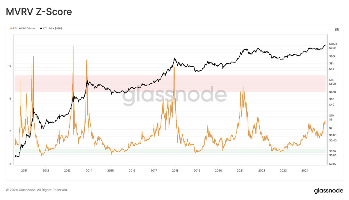
2. Long-Term Holder Profitability: Long-term holders are showing increased profit, but not at the extreme levels seen at previous market tops. While showing some euphoria, it’s not at a level that screams “sell.”
3. Yearly Realized Profit/Loss Ratio: This ratio, which compares profits to losses over the past year, is still below previous peak levels.
4. Market Cap to Thermocap Ratio: This compares Bitcoin’s market cap to its total mining cost. The current ratio is far from the extremes seen at previous market peaks.
5. Thermocap Multiples: Historically, Bitcoin has topped out at 32-64 times its thermocap. We’re currently at the low end of this range, suggesting potential for further upside.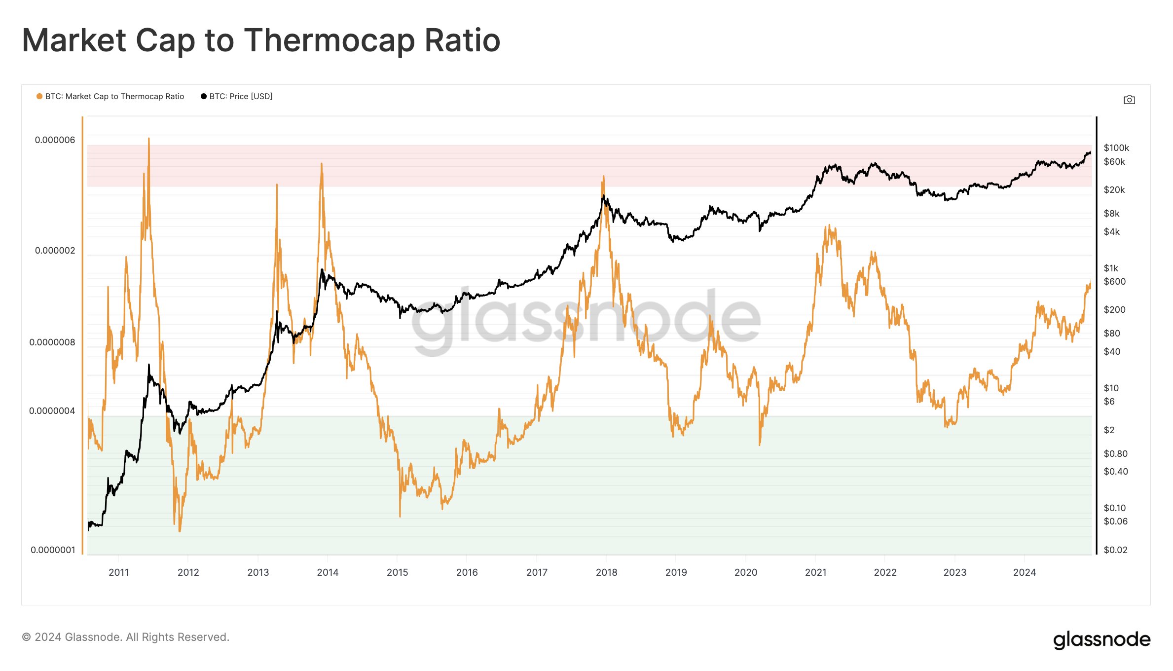
6. The Investor Tool (2-Year SMA x5): This indicator uses a 2-year moving average to predict potential top zones. Bitcoin is far below the level this indicator suggests.
7. Bitcoin Price Temperature (BPT6): This model, based on deviations from a 4-year moving average, shows Bitcoin is not yet in extreme overheated territory.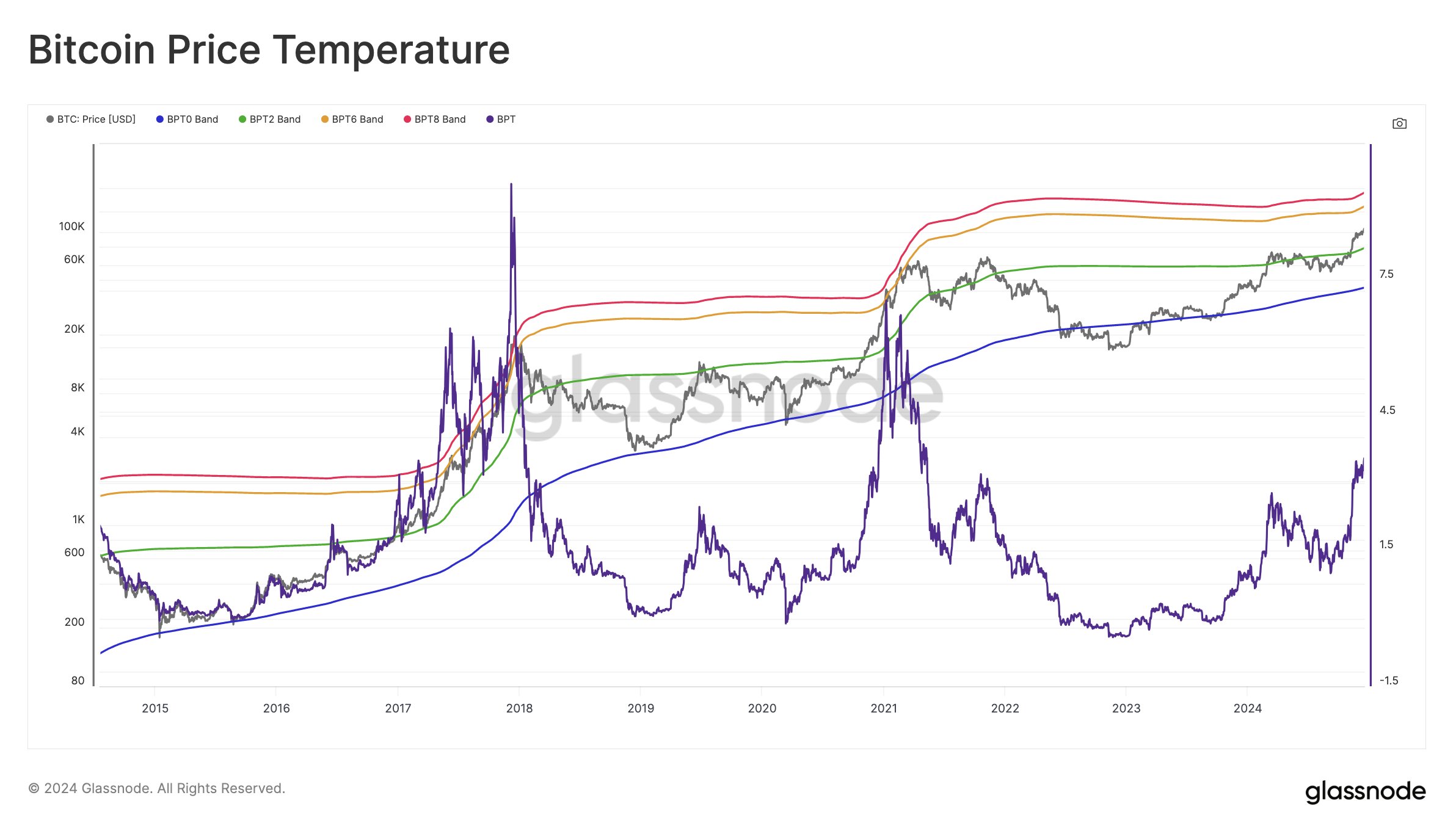
8. True Market Mean & AVIV: These metrics suggest there’s still room for growth before reaching historical extremes.
9. Low/Mid/Top Cap Models: These models, while showing some potential for growth, are less reliable due to changes in the market structure.
10. Value Days Destroyed Multiple (VDDM): This measures the spending behavior of long-held coins. Current levels are not yet at the extremes seen at previous market peaks.
11. The Mayer Multiple: This compares Bitcoin’s price to its 200-day moving average. The current ratio is well below the overbought levels of previous cycles.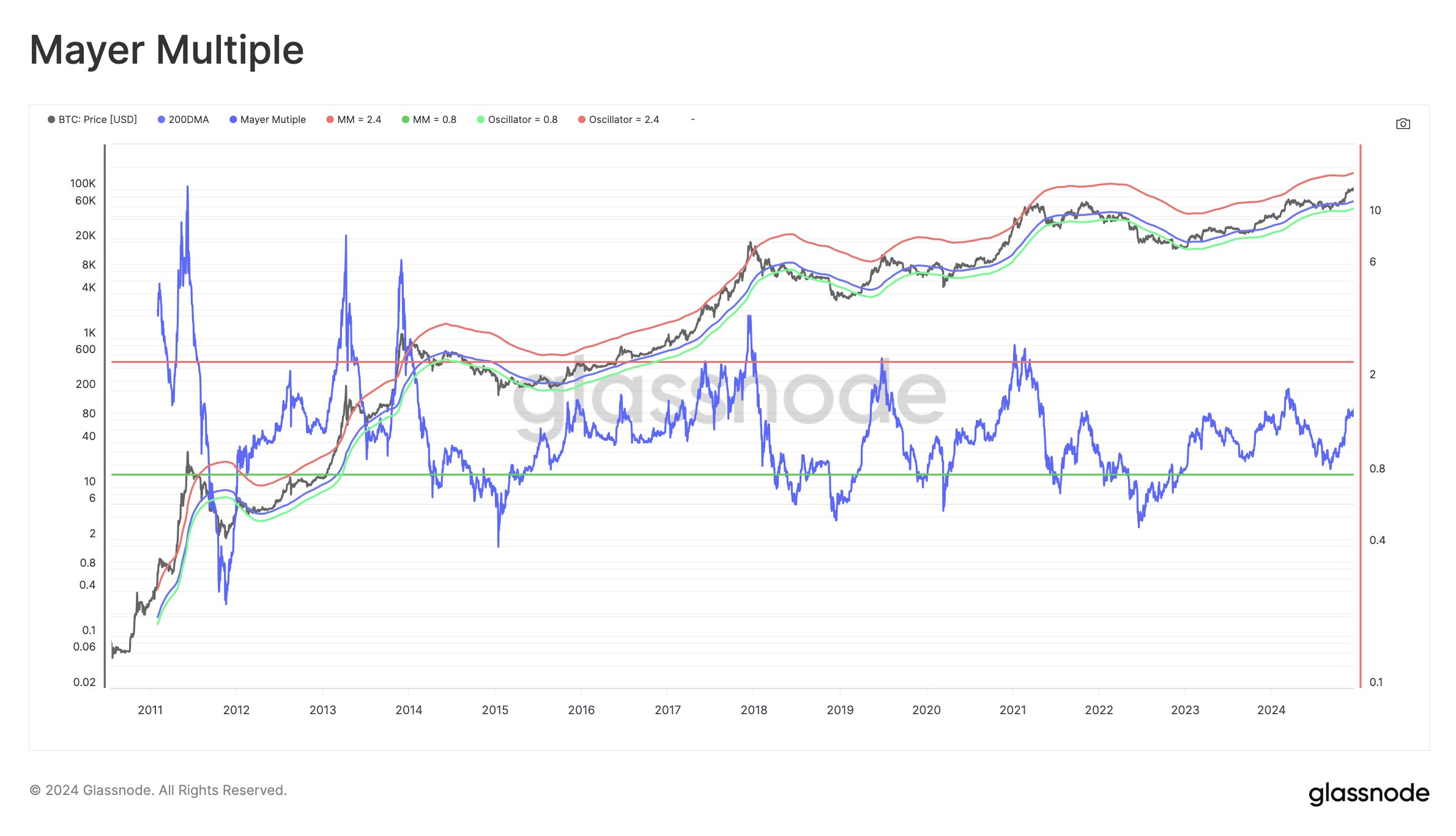
12. Cycle Extremes Oscillator Chart: This composite indicator shows that only some of the conditions for a market top are currently met.
13. Pi Cycle Top Indicator: This indicator, based on moving averages, has not yet signaled a market top.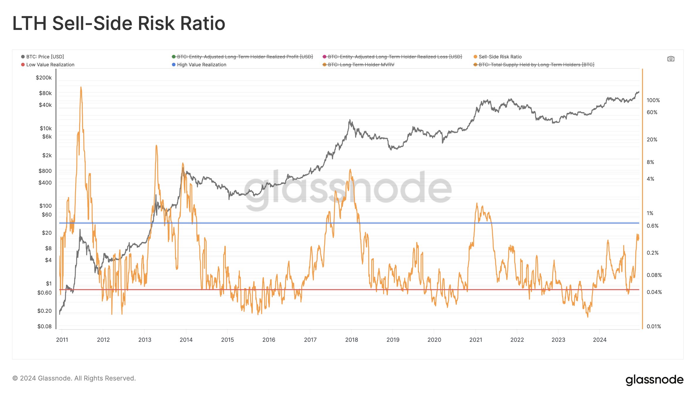
14. Sell-Side Risk Ratio (LTH Version): This ratio suggests that sell pressure from long-term holders is not yet intense.
15. LTH Inflation Rate: This is considered a bearish indicator, suggesting caution.
16. STH-SOPR (Short-Term Holder Spent Output Profit Ratio): Short-term holders are taking profits, but not at a level indicative of a market top.
17. SLRV Ribbons: These ribbons track short- and long-term realized value; they are not currently indicating a market top.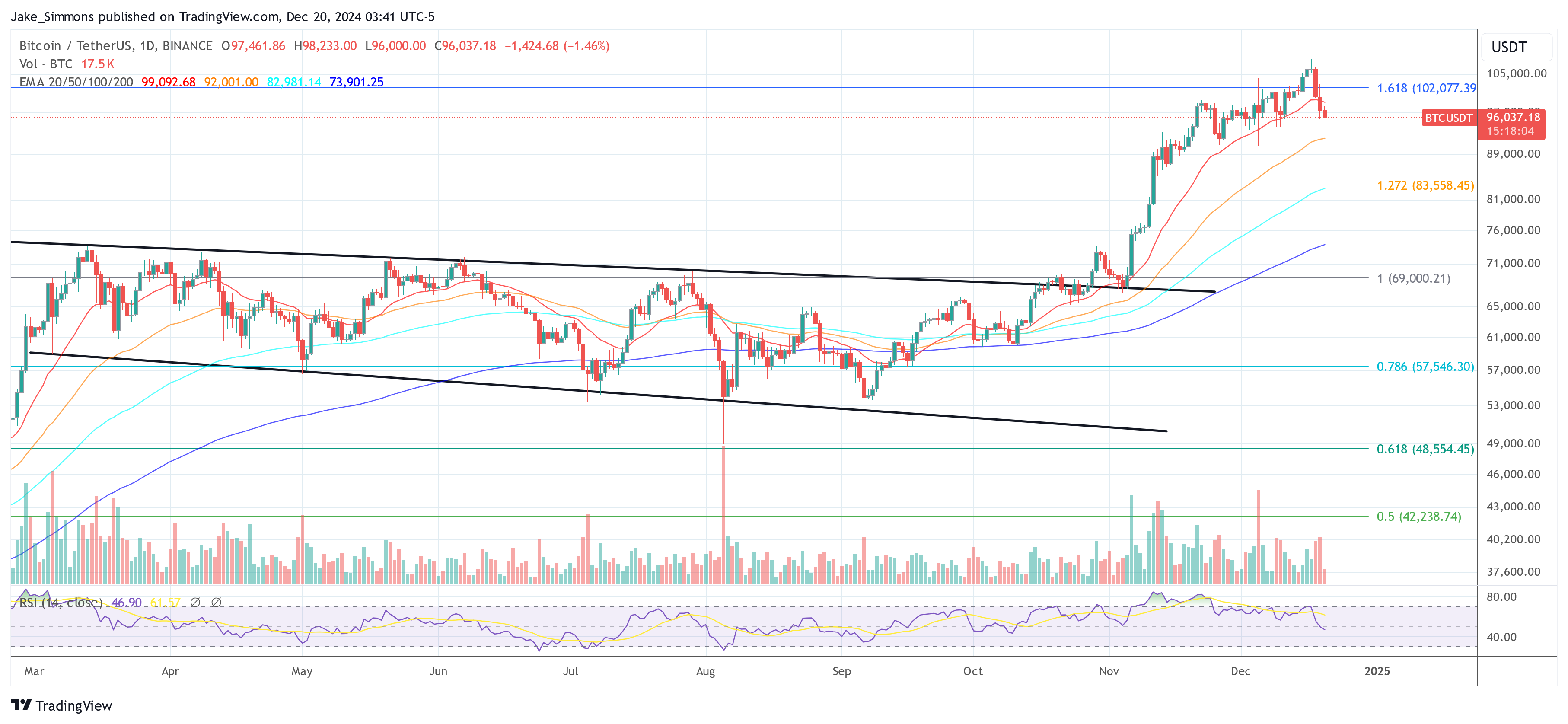
The Big Picture:
While many indicators show Bitcoin moving into more profitable territory, few have reached the extreme levels seen at previous market peaks. Many suggest there’s still room to grow. However, at least one indicator is raising concerns. It’s crucial to remember that these metrics shouldn’t be considered in isolation; a confluence of signals is more meaningful. Also, the Bitcoin market is constantly evolving, making historical comparisons less reliable. The current cycle could be very different from past ones.
At the time of writing, Bitcoin was trading around $96,000.


